In 2H of 2023, we are rolling out an update to our borrower experience. This update optimizes how borrowers interact with the Maxwell digital loan process from application through loan closing. Here is a short breakdown of our most important updates:
- Mobile-first design: Roughly half of the borrowers who engage with their dashboard do so from a mobile device. This update focuses on providing the right information to borrowers at the right time so that stay focused and complete their objectives without distractions.
- Increased clarity on top borrower priorities: Not all tasks are created equal so we've improved the task sorting to ensure the highest priority tasks are always visible at the top, including time-sensitive tasks.
- A clearer sense of progress for borrowers: With this update to the task experience, borrowers can submit tasks for review when they've completed the objective. There are no changes for the lender with this action, but the task list for the borrower will shrink — keeping borrowers focused on what they should do next.
Below, we'll break down the updates in more detail.
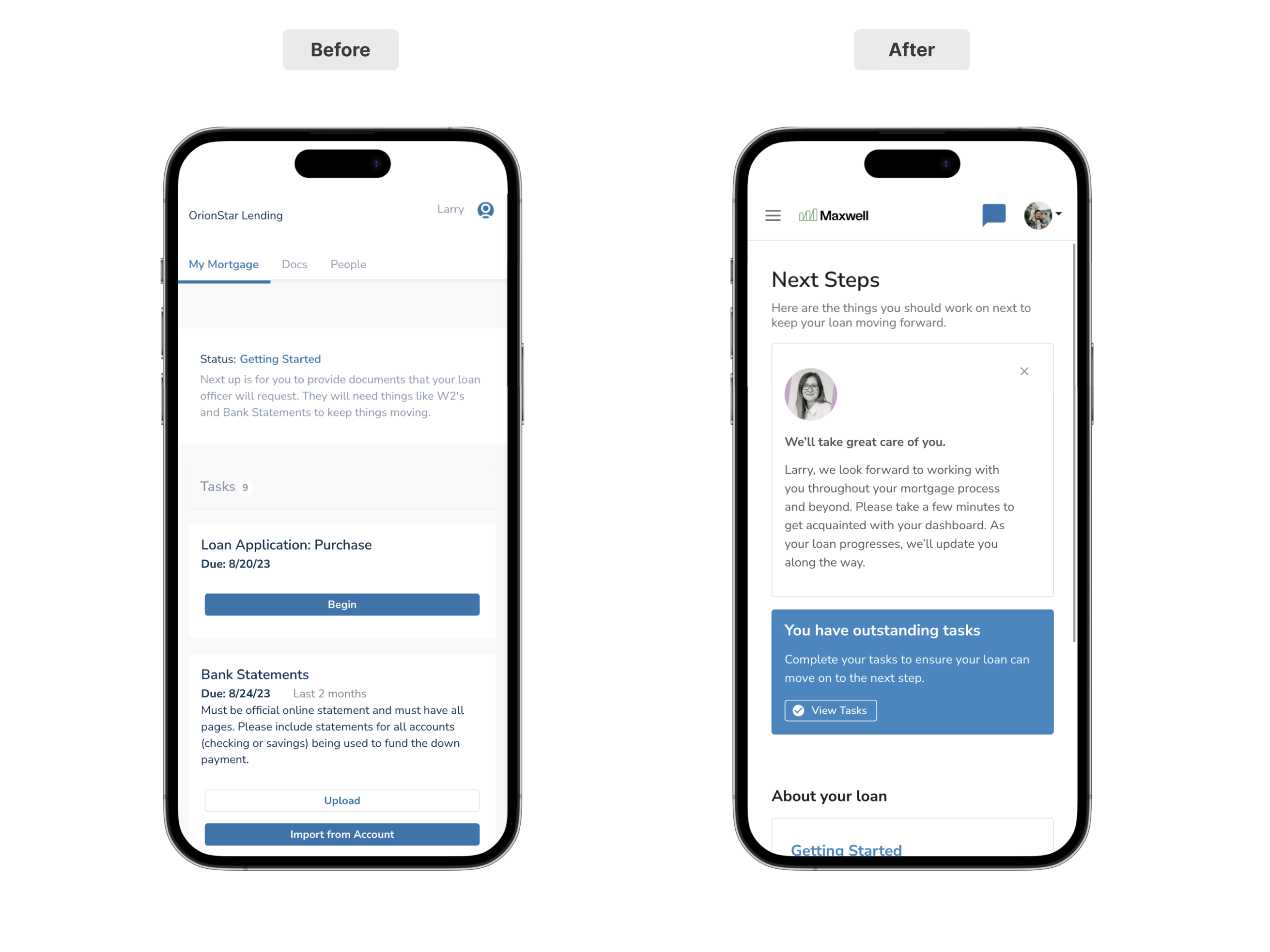
Dashboard Tab
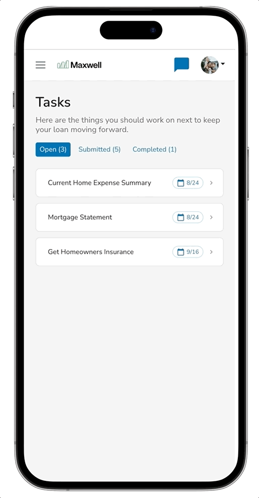
Now when a borrower logs in to their account, we'll take them to their dashboard. The dashboard tab is where a borrower can find high-level information about their loan including statuses, loan details, and any time-sensitive tasks.
Key Updates:
- Contextual Loan Information — We’ve expanded the description on loan status to provide borrowers with a quick description of where they are in the process and what needs to be completed.
- About Your Loan — Provides the borrower some key loan details such as the subject property, estimated loan amount, and contact details for the loan officer managing the account.
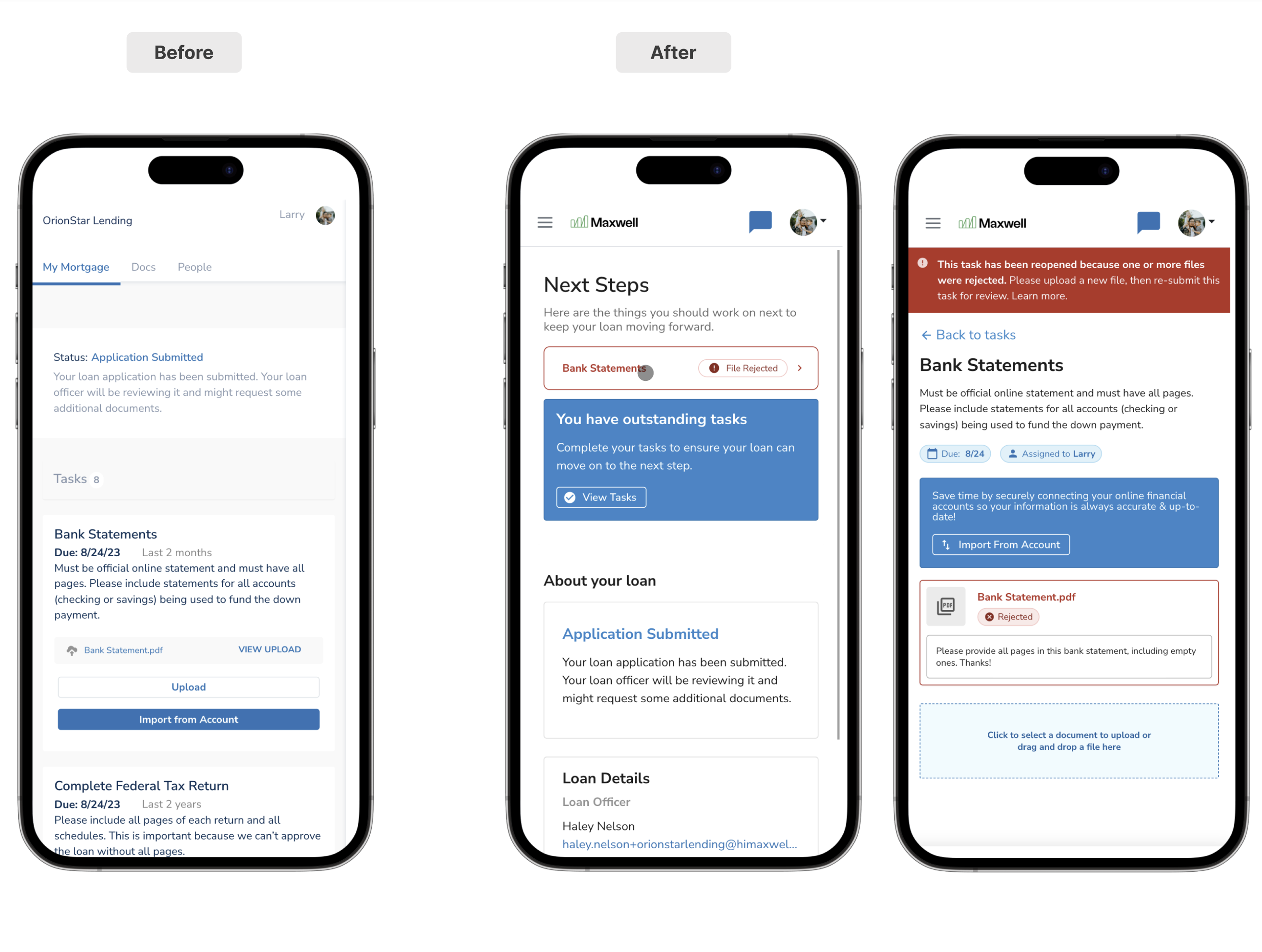
- Clearer Next Steps — When the borrower has any task in an ‘open’ state, we show a notification on the dashboard to help guide them back to work they need to complete to move their loan forward in the process.
- Document Rejections — When a document on a task has been rejected, we’ll visualize that directly on the dashboard along with any details provided by the LO for the reason for rejection so the borrower(s) can quickly resolve the issue.
The example below shows how the new borrower dashboard surfaces time-sensitive information to the borrower, like document rejections. This helps borrowers take action sooner by elevating important tasks to the top of their dashboard.
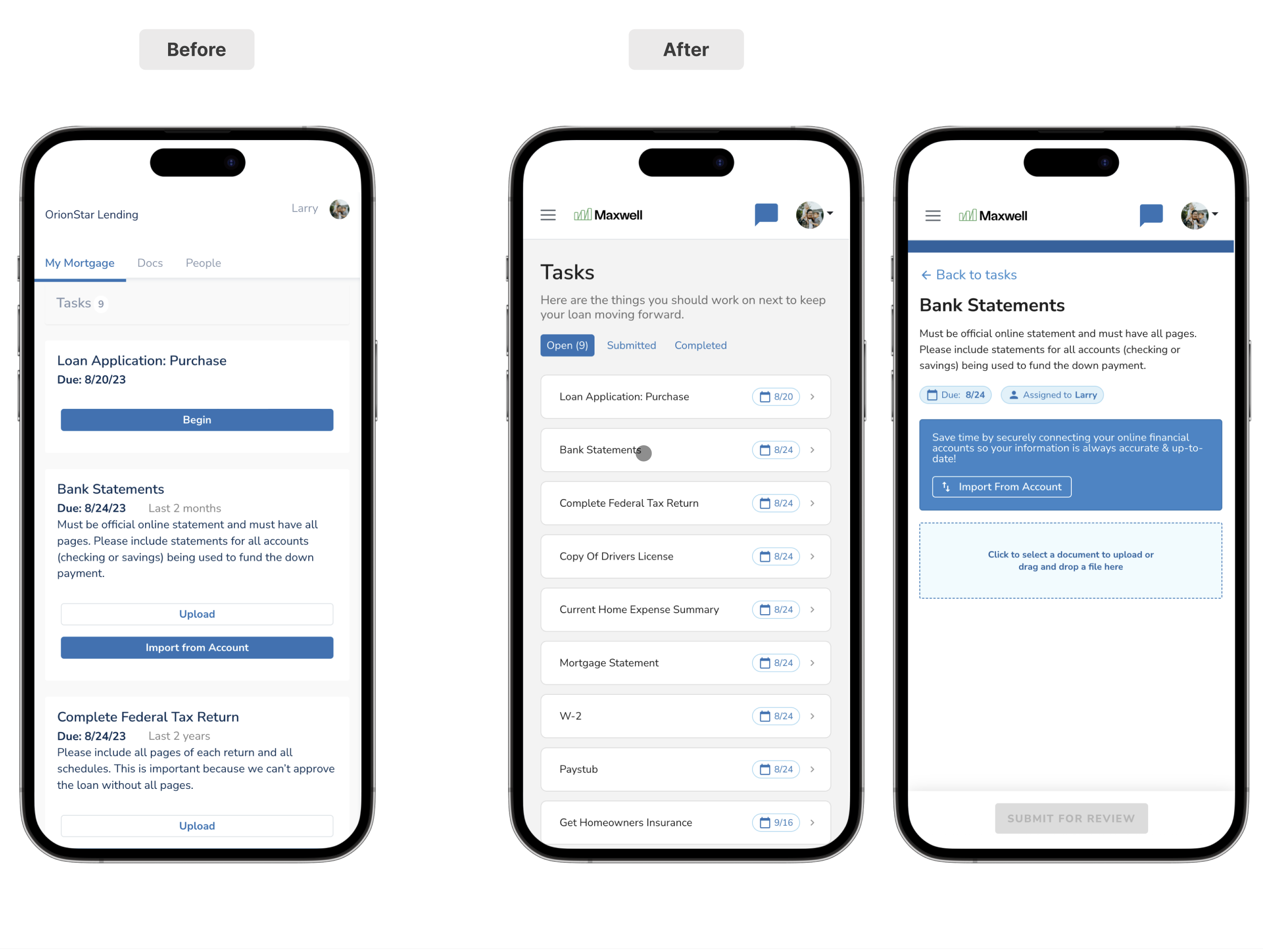
Task Tab
The Tasks user experience is updated to reduce text on the screen, to keep borrowers focused on the next step to complete instead of showing all tasks, descriptions, and documents at one time. This shift in focus allows the borrowers to have a clearer path forward for tasks, and gives them a clearer path to progress along the way. We’ve introduced task categories to clearly communicate where a task is in the process (Open, Submitted, and Completed). And as mentioned previously and we’ve improved rejected document handling.
Key Updates:
- Mobile-First Responsive Design — The task experience has been optimized with responsive design to improve readability and usability on mobile and tablet devices. While we designed with mobile-first experience in mind, our responsive design quickly adjusts to provide an optimized view for laptop and desktop views as well.
- Contextual Improvements — Our previous design visualized all task information, including any details and document uploads, all at the same time. As borrowers would upload documents, the task list would appear to grow, rather than shrink, causing confusion for borrowers. With our latest update, we’re helping borrowers focus on one thing at a time while giving them a clearer sense of progress.
-
Task Categories — The concept of task categories isn’t necessarily new for our Point of Sale platform, but it has been improved to help borrowers understand what they should work on next.
- As borrowers upload documentation to their tasks, they’ll now see a “Submit for Review” call to action. By clicking this, the task will move from open to pending review.
- As borrowers submit tasks for review, the number of actionable tasks in the “open” state will decrease. This will help borrowers focus only on what they need to do next, rather than seeing all tasks all the time.
Below we show the same borrower across the old and new experiences to contextualize how we're helping borrowers visualize their progress.
  |
  |
Note: Nothing changes for the LO’s workflow. When tasks are marked complete by the LO, the task is visualized under the “Complete” tab.
Documents Tab
Now downloading documents happens instantly vs having documents in the queue prior to download. Borrowers may now download one document or many all at once. We’ve simplified this experience by removing unnecessary distractions.
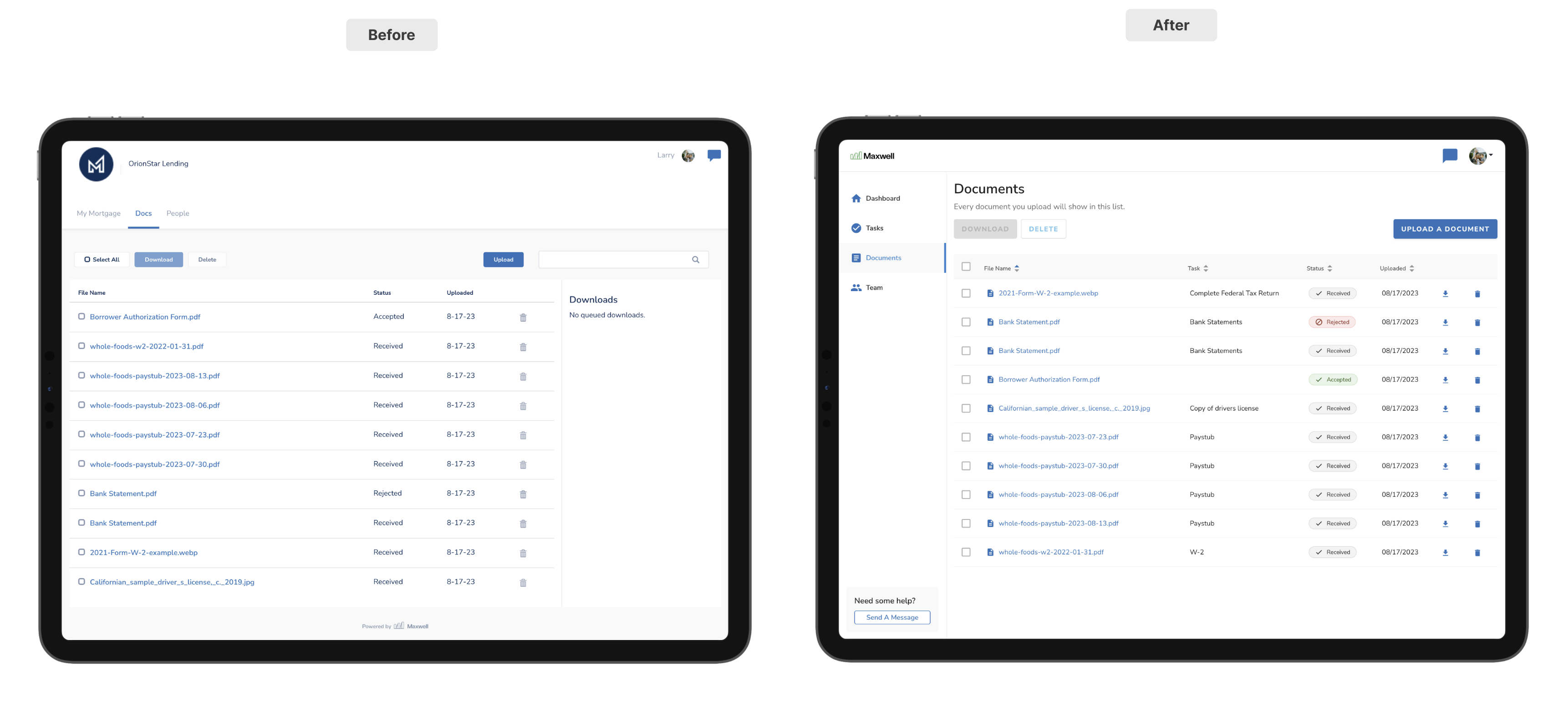
Key Updates:
- Improved Document Context: Document metadata has been expanded to include an associated task if one exists.
- Focused Calls-to-Action: Upload document becomes the primary CTA on this page.
- Focused Document Preview: We’ve adjusted the preview behavior for documents to be faster and easy to use. Now previewing a document opens the document in a modal on top of the existing page which improves navigation (no longer reliant on a hard-to-see back button).
Team Tab
Team cards are now horizontal instead of vertical to help them scale more effectively across all devices. Additionally, we’ve included a CTA to help borrowers start a chat with their LO in case they’re getting stuck.
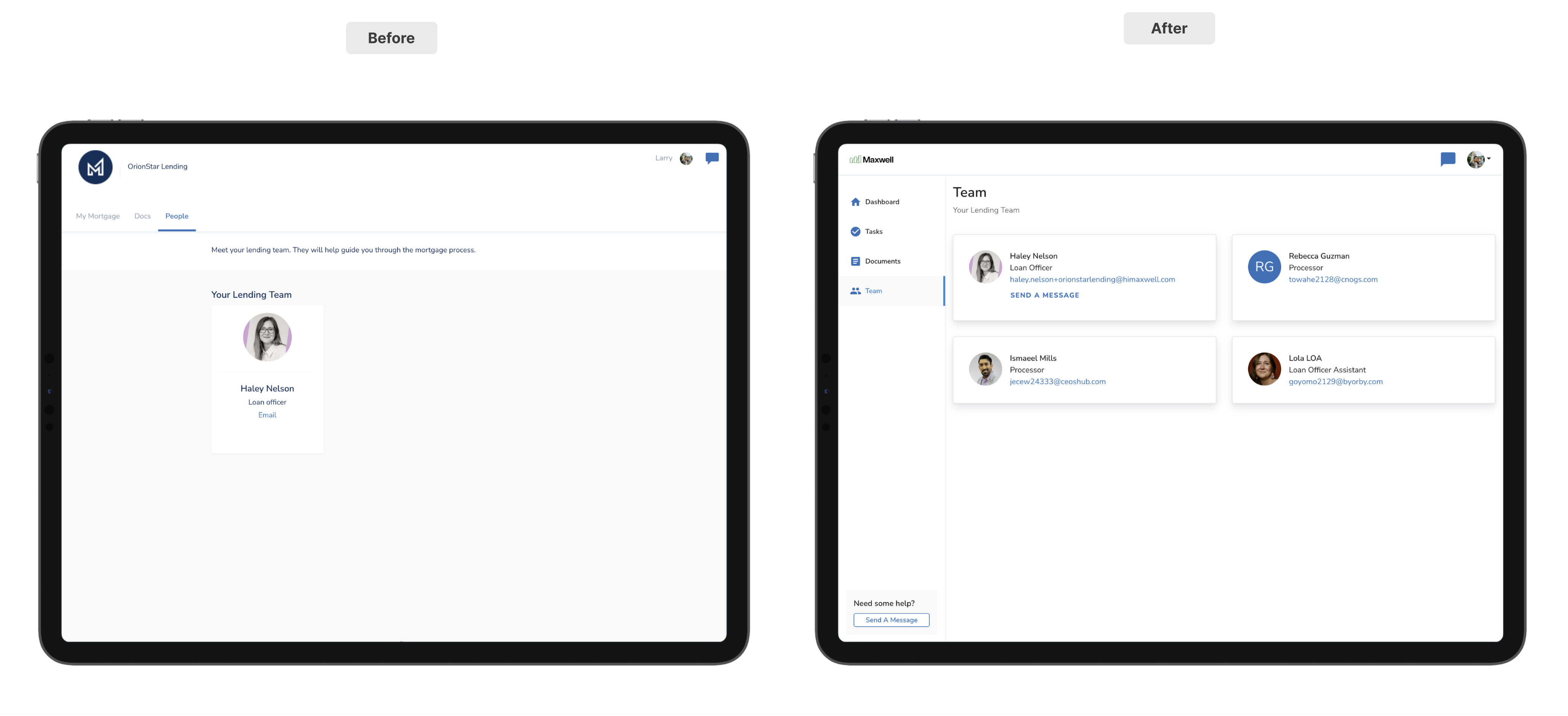
Key Updates:
- Chat Call-to-Action on LO Card: We’ve made it easier to start a chat with LOs from the Team tab. “Send a message” now opens a chat.
Demo of the New Borrower Experience
If you want more details please reference this 5-minute overview of our New Borrower Experience.